 加微信 [ooiove]聊未来
宅喜欢与你同行
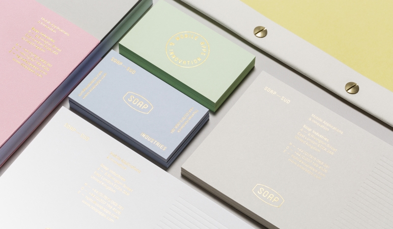
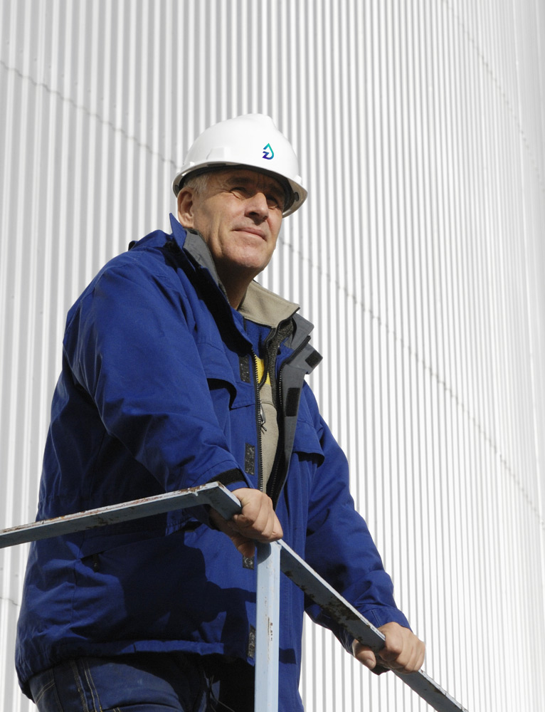
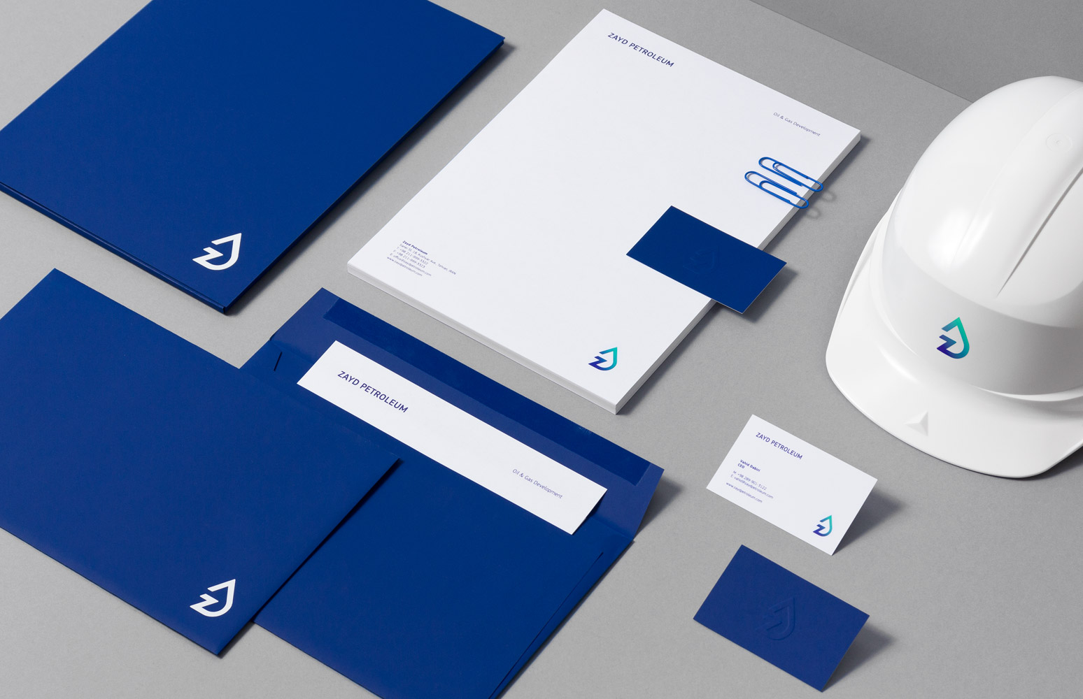
黑兰石油品牌包装VI设计

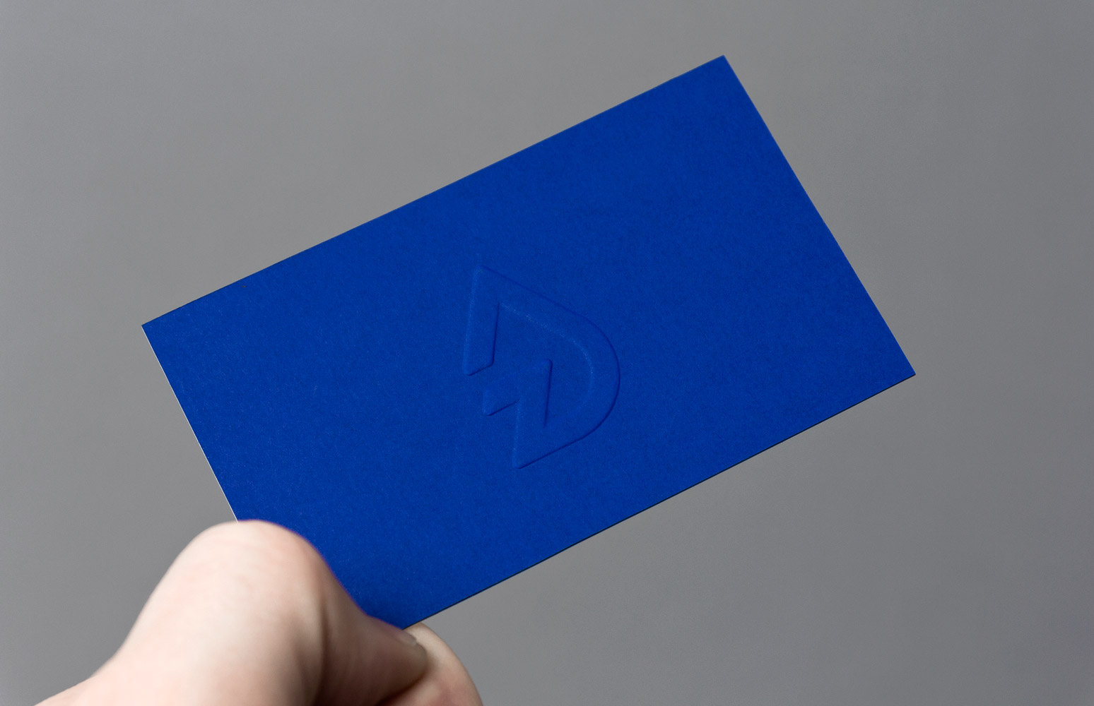
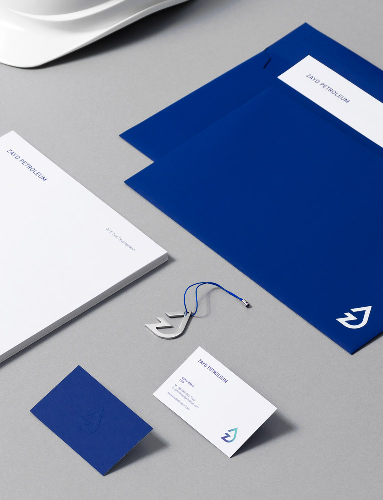
波兰[forbrands]品牌包装设计事务所2011年为伊朗黑兰石油公司的品牌VI设计&包装设计案例,据说标志的设计是以Z字母符号反映了石油天然气火焰,象征生意红红火火,Zayd Petroleum 靛蓝色代表肩负社会责任,给世界公民一片蓝天给北京的却是雾霾的生活,你说我们中国屌丝多泪奔啊!名片是用2层进口纸互表(靛蓝+额外的白色),马克背面浮雕标志是采用德国库尔兹烫金技术.
We’ve created an identity for a company located in Tehran, working in the field of oil and gas development. It was a huge challenge for us, especially when it comes to Iran, a country with one of the largest reserves of petroleum and natural gas in the world.
We‘ve designed a bold symbol reflecting the oil drop & gas flame, combined into one shape with the letter Z.
For the corporate identity our choice was a high quality coloured paper stock – Antalis Skin Indigo with a white foil block printing. Business cards were made out of 2 laminated paper sheets (Indigo + Extra White), with the embossed logo mark on the reverse. We’ve also designed a small promotional element, i.e. metal keychain.
编辑:宅喜欢温度 分享:www.oooiove.com


联系_宅喜欢与你同行T—020-81040223 F—020-81040583
服务_橱窗设计 |
陈列道具 |
礼盒包装 |
纸袋 |
纸盒包装 |
实木衣架
微博_http://weibo.com/ttrunk
交流_QQ群_35036638 注明陈列学习 微信_ooiove
来源_宅喜欢官网www.ooiove.com
色彩_GUCCI玫瑰金_黑枪色_铬色_LV钛金_金色_铁锈色_青古铜
声明_所有发布的图文信息如有巧合雷同请于作者联系,以上信息不代表宅喜欢与作者本人