 加微信 [ooiove]聊未来
宅喜欢与你同行
Meltin Pot的橱窗设计创意
.jpg "Meltin Pot的橱窗设计创意")
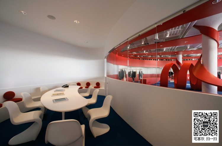
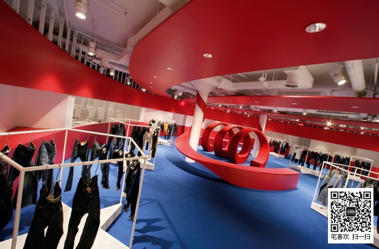
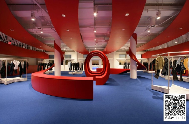
Meltin'Pot的名称是从一个伟大的肯尼迪乌托邦翻译而来,Meltin'Pot在纽约以黑暗时代为主题的橱窗设计创意,Meltin'Pot专卖店设计重新审视美国文化的名称,星条旗梦已经变成了帝国主义的噩梦,美国梦是以一个民族共享的态度,慷慨的人,这是一个自由的土地,多年认为是自由的象征标志,Meltin'Pot空间设计解构标志,创造一个时尚的购物空间,Meltin'Pot是美国梦的理想代言,它是爱的宣言。“JFK我们都是美国人”
Meltin'Pot专卖店设计以星条旗梦的红色为主色,地板搭配深蓝色,专卖店内还配有咖啡休闲商务厅,所有的椅子,展示架,海报架都是以DIOR米白色为主,据时尚小记说这里面的咖啡是免费喝的哟!
A name like Meltin’Pot and the decision to open a showroom in New York in the dark ages of the Bush era leads me to re-examine American culture. The Star Spangled Dream has turned into an imperialist nightmare.
That flag, for many years considered a symbol of liberty, is nowadays regarded all too often with resentment. Restoring that ideal is a matter that concerns all of us.
America is a nation of people who share an attitude of liberality, it is a land of freedom. The name Meltin’Pot was borrowed from one of the great Kennedy utopias, and this is our US frame of reference. Deconstructing the flag to create a space is an attempt at reclaiming that ideal, it is a declaration of love.ACRYLIC HANEGERS
Paraphrasing JFK: “we are all Americans”.
Paraphrasing JFK: “we are all Americans”.
编辑:宅喜欢温度 分享:www.oooiove.com


联系_宅喜欢与你同行T—020-81040223 F—020-81040583
服务_橱窗设计 |
陈列道具 |
礼盒包装 |
纸袋 |
纸盒包装 |
实木衣架
微博_http://weibo.com/ttrunk
交流_QQ群_35036638 注明陈列学习 微信_ooiove
来源_宅喜欢官网www.ooiove.com
色彩_GUCCI玫瑰金_黑枪色_铬色_LV钛金_金色_铁锈色_青古铜
声明_所有发布的图文信息如有巧合雷同请于作者联系,以上信息不代表宅喜欢与作者本人
-
 橱窗陈列
私人订制给微商代言|shed
橱窗陈列
私人订制给微商代言|shed
-
橱窗陈列 你永远看不懂VALENTINO的迷彩橱窗
-
 橱窗陈列
你为什么给明月烧坏了脑shed
橱窗陈列
你为什么给明月烧坏了脑shed
-
 橱窗陈列
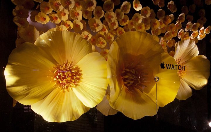
我不是橱窗里的花|APPLE
橱窗陈列
我不是橱窗里的花|APPLE
-
 橱窗陈列
地球只剩下你|你还有什么意义?
橱窗陈列
地球只剩下你|你还有什么意义?
-
 橱窗陈列
长得丑不要怪妈咪TTRUNKS
橱窗陈列
长得丑不要怪妈咪TTRUNKS
类别 专卖店设计
品牌 Trussardi 托鲁纱缔
时间 1380020369
国家 法国
设计 宅喜欢衣橱设计
官网 www.oooiove.com
产品 亚克力衣架Acrylic hangers
学名 鞋架Shoes rack
学名 袖扣盒Cufflinks box
风格 商务男装
品牌 Trussardi 托鲁纱缔
时间 1380020369
国家 法国
设计 宅喜欢衣橱设计
官网 www.oooiove.com
产品 亚克力衣架Acrylic hangers
学名 鞋架Shoes rack
学名 袖扣盒Cufflinks box
风格 商务男装